FÜD FARE
Making grocery prices feel simple required building something surprisingly complicated.
Independent grocery stores can offer some of the most competitive produce prices in a neighborhood, but finding those prices often means searching across individual websites, weekly flyers, PDFs, and promotional images—then trying to compare offers expressed in completely different units and quantities.
I created Füd Fare to turn that fragmented information into a simpler shopping experience. Shoppers set how far they’re willing to travel, browse produce prices available within that radius, and use the Füd Meter to see how each price compares with similar items nearby. As they build a Füd List, the platform evaluates the basket across local stores and recommends where that combination of items offers the strongest value.
Behind that simple experience is a much harder problem: grocery flyers were never designed to function as structured data. Prices appear by pound, each, bag, box, pint, count, multi-buy, and conditional promotion—and the source itself might be an image, PDF, or HTML catalogue. I designed a pipeline that interprets those sources, normalizes comparable products and units, challenges uncertain results, and withholds comparisons when the system can’t support them confidently.
I conceived the product, brand identity, UX/UI, data architecture, and validation logic, using AI-assisted development to implement the working prototype over roughly three weeks. The result spans 25 Chicago-area store locations across seven local grocery groups while presenting the shopper with something intentionally much simpler: what’s cheap near me, and where should I shop?
25
Store Locations
7
Local Grocery Groups
3
Source Formats
3
Weeks Concept → Working Prototype
1
Comparable Price System
01 — The Opportunity
The best price isn’t useful if nobody can find it.
Local and independent grocers can compete aggressively on produce, but they don’t always have the same digital infrastructure or marketing reach as national chains. Many still rely heavily on weekly circulars—distributed through individual websites, PDFs, promotional images, and printed flyers—to communicate their best prices.
For a shopper, that creates a fragmented experience. Finding the lowest price nearby can mean visiting multiple store websites, opening individual flyers, locating the same product in each one, and then figuring out whether $0.99/lb, 2 for $3, and a $4.99 multi-pound bag are actually comparable.
The information exists. The work required to use it is the problem.
One shopping list. A dozen places to look.
Find the product
Interpret the offer
Convert the unit
Compare with another store
Repeat
Too much work for a decision that should take seconds.
Local stores weren’t necessarily more expensive. They were harder to compare.
Before building Füd Fare, I compared advertised produce specials from several Chicago-area independent grocers against pricing at several nearby Aldi locations. In that exploratory sample, the local-store promotion was cheaper roughly 40% of the time.
It wasn’t a comprehensive market study, but it challenged an assumption behind the way I shopped: the larger chain wasn’t automatically offering the lowest produce price. Independent stores could be highly competitive—their offers were simply harder to discover and compare.
Large chain
Price
App
Search
Loyalty account
Digital promotion
Shopper
Local grocer
Price
Weekly flyer
PDF / image / website
Mailbox / store page
???
Shopper
Füd Fare
Turn the flyer into something searchable, comparable & local
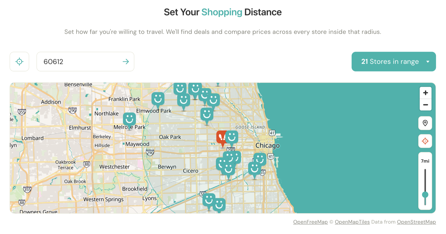
Start with where the shopper actually lives.
A theoretically lower price isn’t useful if reaching it costs more in time and transportation than the shopper saves.
I designed Füd Fare around a user-defined shopping radius rather than a citywide leaderboard. Shoppers choose how far they’re willing to travel, and the product limits comparisons to stores inside that area.
That changes the question from “Where is this cheapest?” to “Where is this cheapest for me?”
Designed around the shopper, not the SKU.
I deliberately started with produce because it offered a path toward comparison without requiring access to proprietary retailer SKU systems. The shopper doesn’t need to know which internal product identifier a store uses for a Bartlett pear or English cucumber. They need to know what it is, how it’s being sold, what it costs, and whether another store nearby offers meaningful savings.
That premise sounded simple.
Making the underlying prices genuinely comparable turned out to be anything but.
02 — The Experience
From weekly flyer to one shopping decision.
Füd Fare is organized around a simple question: what’s worth buying near me?
Rather than asking shoppers to browse individual stores, the experience begins with their location and how far they’re willing to travel. Füd Fare then builds a local price view from every participating store inside that radius, allowing shoppers to browse produce by category, compare current offers, and add items to a running shopping list.
The complexity of normalizing those prices stays underneath the interface. On the surface, the experience is designed to move through four straightforward decisions.
Location → Value → List → Decision
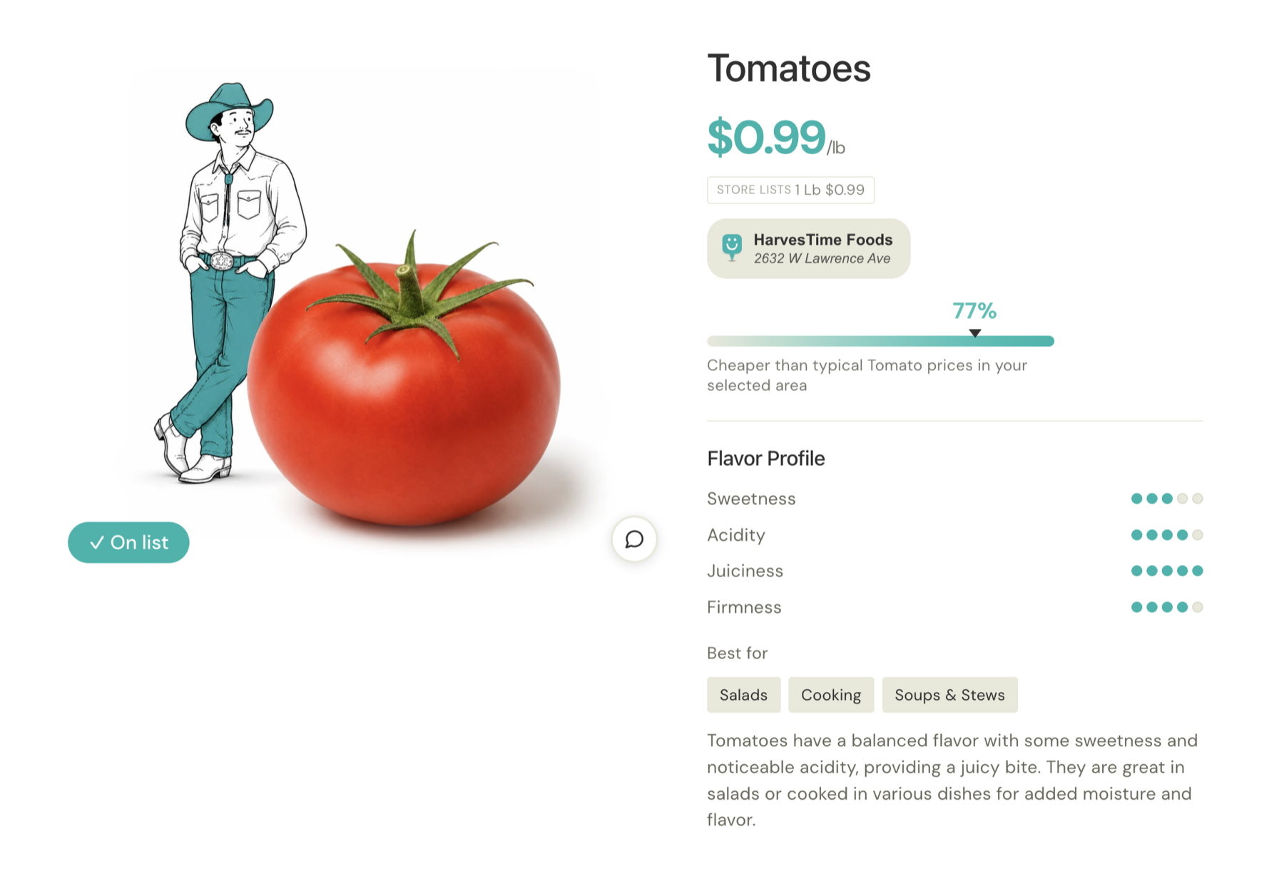
The Füd Meter
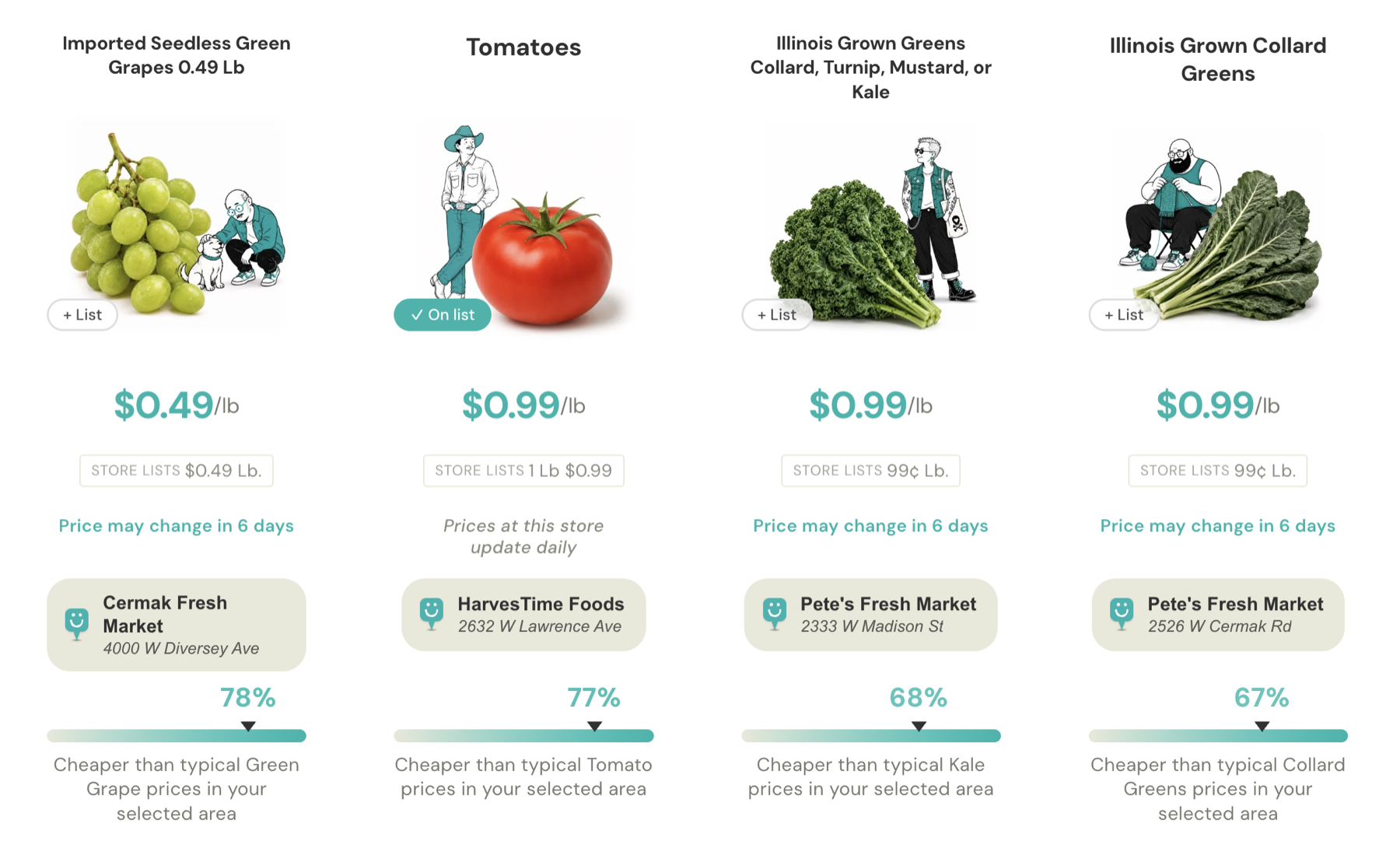
Make relative value visible.
Individual prices don’t always communicate whether something is actually a strong offer. Füd Fare therefore compares eligible prices against other listings for the same produce category within the shopper’s selected area.
I translated that comparison into the Füd Meter, borrowing the familiar visual language of airfare price trackers. Instead of asking someone to mentally compare a collection of grocery prices, the interface gives them an immediate indication of how far a current offer sits below typical advertised pricing nearby.
Keep the original offer intact.
Normalization doesn’t replace the store’s advertised offer. Füd Fare preserves the promotion as it was presented while adding a comparable unit price when the underlying information supports one.
A shopper can therefore understand both sides of the offer: what they actually have to buy to receive the price, and how that price compares with alternatives nearby.
Store says
Buy 5 for $2.99
Füd Fare adds
$0.60 / each
Shopper understands
The deal + the comparison
Füd List
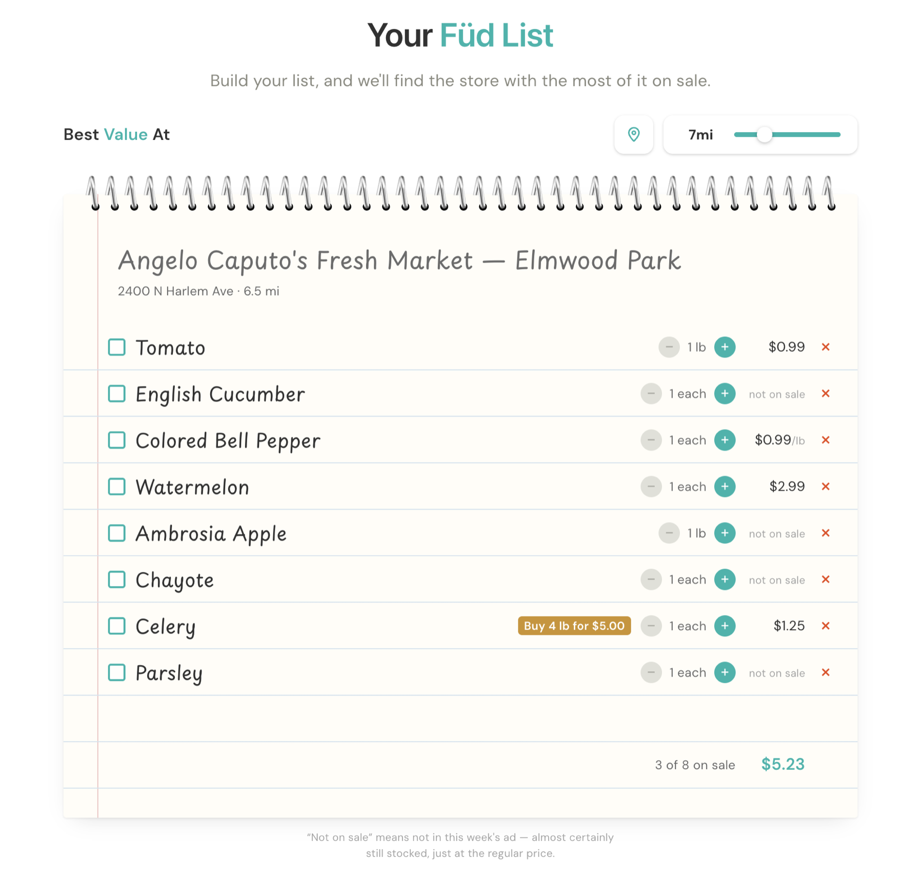
Build the basket before choosing the store.
Finding the cheapest tomato is useful. Finding the cheapest store for the groceries you actually need is more useful.
Shoppers can add produce directly from the price directory to a running Füd List. Instead of optimizing each item independently and sending someone across the city chasing individual specials, Füd Fare evaluates the basket as a whole and identifies the store offering the strongest value across the items it can fulfill.
Optimize the trip, not every individual item.
I deliberately avoided designing the experience around an unlimited multi-store optimization. A mathematically perfect grocery route isn’t necessarily a useful one if saving a few additional dollars requires visiting three or four different stores.
Füd Fare prioritizes the strongest single-store basket and can surface a second stop when the additional savings make it worthwhile. The goal isn’t to find the theoretical cheapest combination at any cost. It’s to help the shopper make a better real-world decision.
Mathematically cheapest
Store A → Store B → Store C → Store D
4 stops · maximum theoretical savings
Füd Fare
Your list → Store B
1 stop · strongest overall value
+ Store C — second stop only when worth it
Use the list while you shop.
Füd List continues into the shopping trip itself. Items can be checked off as they’re purchased, turning the same system used for price comparison into a lightweight shopping list rather than forcing the user to move between separate tools.
One radius. One list. One decision.
Where am I?
What’s cheap nearby?
What do I need?
Which store makes the most sense?
The experience was intentionally simple. Making the data underneath it trustworthy was not.
Before Füd Fare could compare two prices, it first had to determine whether those prices were actually comparable at all.
03 — The Normalization Problem
A price isn’t useful until you know what it means.
Grocery flyers describe the same basic transaction in dozens of different ways. Produce might be priced by pound, each, bag, box, pint, package, or count. Promotions introduce another layer: multi-buy offers, quantity requirements, conditional discounts, and package sizes that aren’t always stated clearly enough to support a direct comparison.
For Füd Fare to answer something as simple as “Which store has cheaper avocados?”, it first had to determine what each store was actually selling, how much product the shopper receives, what conditions apply to the advertised price, and whether that offer can legitimately be compared with another one.
That made normalization one of the fundamental product problems behind the entire experience.
$1.49 / lb
2 / $1
5 ct bag · $2.99
Buy 3 · get 1
$3.99 / pint
$8.99 / box
3 lb bag · $4.99
Which one is cheaper?
Sometimes the answer can be calculated. Sometimes it can’t. Knowing the difference became part of the system.
Normalize the offer without rewriting it.
I designed Füd Fare around two parallel representations of price. The first preserves what the store actually advertised—the quantity, unit, promotion, and conditions the shopper must satisfy. The second derives a standardized price only when enough information exists to support one.
Conditional promotions follow the same principle. If a shopper must purchase four items to receive a buy-three-get-one offer, the interface can’t present the effective unit price without also preserving the quantity required to earn it.
Advertised offer
What the shopper actually has to buy.
5 ct bag — $2.99
Normalized value
What can defensibly be compared.
$0.60 / each
Context
How it compares nearby.
46% cheaper than typical
Preserve the transaction. Normalize the comparison.
Comparable doesn’t always mean identical.
Unit conversion solved only part of the problem. Before two prices could be compared, Füd Fare also needed to determine whether the underlying products belonged in the same comparison at all.
Grocery flyers range from extremely specific varietal names to broad labels like “apples,” “grapes,” or “cucumbers.” I developed a produce taxonomy built around micro-categories that preserve meaningful distinctions while still allowing less-specific listings to participate where the comparison remains defensible.
Apples
An unnamed apple is always apple — a cultivar is used only when the listing text names it
apple
Generic listing
premium_apple
Price tier
Nine per-cultivar micros
Pooling nine cultivars into two rows was hiding real inventory. One store printed nine apple prices while the directory showed two—reading as a $0.69/lb apple store while its Honeycrisp sold at $2.99. The meter now prefers the cultivar when it has three distinct stores and falls back to the price tier when it doesn’t.
Group by price similarity, never by taxonomy
The taxonomy had to be allowed to admit ignorance.
Produce turned out to be far more diverse than I expected. As new flyers entered the system, unfamiliar varieties and regional items continually appeared that weren’t represented in the existing taxonomy.
Rather than forcing an unknown product into the closest available category, the pipeline can flag it as a new candidate and exclude it from comparison until its classification is resolved.
An unknown product couldn’t quietly contaminate the pricing benchmark.
Some prices should never reach the Füd Meter.
Not every valid grocery listing can be converted into a meaningful comparison. A store may advertise produce by crate without providing enough information to determine its weight. A package may contain an unknown number of items. A flyer may state a price clearly while leaving the quantity ambiguous.
Instead of treating normalization as all-or-nothing, I separated shopping visibility from comparison eligibility. A listing can remain available to the shopper using the store’s original advertised price while being excluded from the Füd Meter when the system can’t derive a defensible equivalent unit.
Listing found
Do we understand the offer?
No → Withhold
Can it be normalized?
No → Display original price
Enough comparable local data?
No → Display price
Füd Meter eligible
Comparison needed a minimum standard.
Füd Fare doesn’t generate a local benchmark from a single competing price. The Füd Meter requires multiple comparable listings using compatible units before it describes an offer as cheaper than typical in the selected area.
That constraint means some products receive a full relative-price signal while others simply display their current advertised price. The interface intentionally communicates less when the underlying dataset supports less.
3 comparable stores
Minimum before the meter makes a claim
More information wasn’t automatically better. The amount of information shown had to match the amount of confidence underneath it.
From flyer language to comparable value.
Store A
2 for $1
$0.50 / each
Store B
5 ct bag · $2.99
$0.60 / each
Store C
$0.69 each
$0.69 / each
Comparable
Creating comparable units solved the mathematical problem. It didn’t solve the more dangerous one.
What if Füd Fare misunderstood the flyer before the math even started?
The source material was inconsistent, visually dense, and sometimes ambiguous enough that a single incorrect interpretation could send a shopper to a store expecting a price that didn’t exist.
That meant extraction couldn’t simply be automated. It had to be challenged.
04 — The Trust System
When the data is messy, confidence has to be earned.
Füd Fare ultimately makes a promise to the shopper: if the interface says a store is offering a certain price, that information needs to be trustworthy enough to act on.
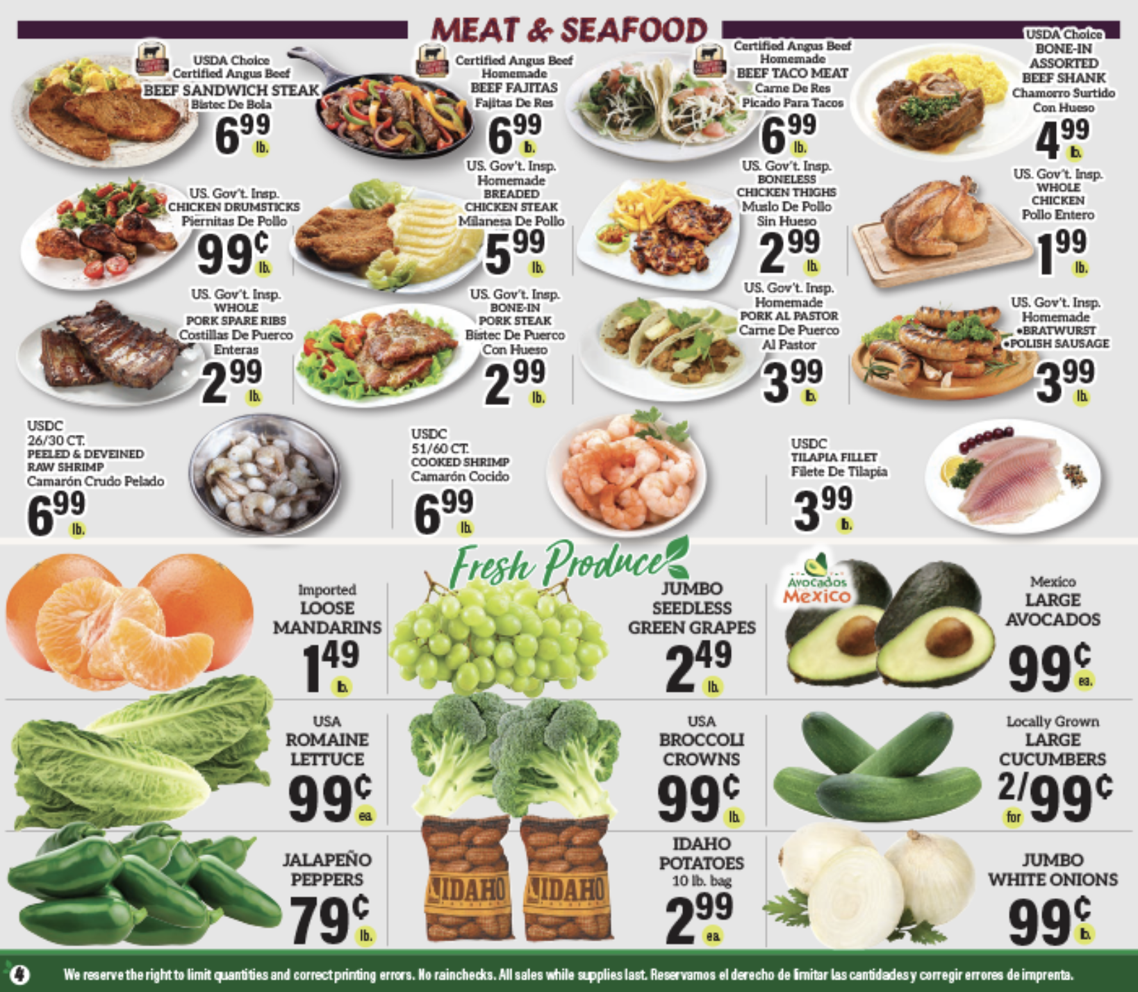
That was difficult because the source material was never designed for machine interpretation. Weekly flyers combine photography, typography, promotional graphics, overlapping products, fine-print units, conditional offers, and inconsistent layouts. A tiny “EA” mistaken for “LB” can turn a perfectly reasonable grocery price into a completely misleading one.
I couldn’t eliminate uncertainty from the source material. Instead, I designed the pipeline so uncertain information had to survive multiple independent checks before it was allowed to become consumer-facing data.
The system wasn’t designed to always produce an answer. It was designed to know when an answer had earned the right to be published.
Don’t trust the first answer
The source material.
Flyer
Extractor A
Product — Green onion
Unit — LB
Extractor B
Product — Green onion
Unit — EA
Disagree
Referee
Re-evaluate the disputed row with narrower context. Up to two rounds.
No agreement. No assumption.
Give AI the ambiguous work, not the arithmetic.
Once an item has been identified, the extraction stage is deliberately narrow. The model’s job is to transcribe the facts visible in the flyer: the advertised price, quantity, unit, package information, and promotion conditions.
It does not decide what a multi-buy costs per item. It does not determine the effective price of a package. It does not calculate comparable units. Those operations are handled separately through deterministic logic.
I made that separation intentionally. A language model that performs arithmetic correctly almost every time still isn’t reliable enough for a system that may publish thousands of consumer-facing prices.
AI / Vision — read
“5 ct bag”
“$2.99 ea”
Deterministic code — calculate
$2.99 ÷ 5
= $0.60 / each
Interpret with AI. Calculate with code.
Then challenge the result again.
Even correctly extracted information can produce misleading results once units, quantities, and package sizes are converted. Manual auditing exposed prices that were technically explainable by the available information but obviously wrong in the context of normal grocery shopping.
Chives appeared at more than $50 per pound. Kiwi approached $60 per pound. Other products produced similarly absurd normalized values when package assumptions or units didn’t line up with the way the item was actually sold.
Chives — $56 / lb
Mathematically valid ≠ consumer valid
Implemented guards · index/priceMeter.ts
Auditing became part of the architecture.
“Very ugly until I started putting audit breakpoints and forcing reruns. It was a disaster.”
Early automated runs weren’t reliable enough. Manual item-by-item audits exposed missing products, incorrect classifications, unit errors, unexpected produce varieties, and cases where confident model outputs were simply wrong.
Rather than treating those failures as one-off corrections, I used them to redesign the system. Audits produced new taxonomy rules, normalization logic, sanity checks, disagreement handling, source validation, and explicit failure states.
Early
Extract
Normalize
Publish
Find error
Later
Extract
Consensus
Referee
Normalize
Sanity check
Audit / validate
Publish
Every failure became another rule the next price had to survive.
Sometimes the correct output is nothing.
The most important change wasn’t another extraction technique. It was accepting that Füd Fare didn’t need to answer every question.
If the source doesn’t clearly establish the unit, the system shouldn’t infer one. If two independent reads can’t resolve a product, it shouldn’t be forced into the taxonomy. If a package can’t be normalized confidently, it shouldn’t influence the Füd Meter.
A missing comparison is inconvenient. A confidently wrong price breaks trust.
The complete trust path
Messy input. Defensible output.
Messy flyer
01 — Acquire
Find and capture the current source.
Messy input. Defensible output.
Don’t waste the expensive work
Store flyers typically change weekly, while Füd Fare checks sources daily because publishing schedules and URLs can change unexpectedly. Before running extraction, the system determines whether the underlying source has actually changed. If it hasn’t, processing stops before expensive model work begins.
Check daily. Process only when needed.
None of these safeguards are visible to the person shopping. They see a tomato, a store, a price, and a Füd Meter.
That’s the point. The technical system exists to absorb complexity so the consumer experience doesn’t have to.
Trust is part of the interface, even when the user never sees how it’s built.
05 — The Brand
Güd Füd. Local Fares.
Füd Fare was built around saving money, but I didn’t want it to look like a traditional discount platform. Grocery savings already comes with a familiar visual language—coupons, sale bursts, crowded circulars, oversized prices, and interfaces designed around urgency.
I wanted Füd Fare to feel different: friendly, useful, slightly strange, and distinctly local.
I developed the brand alongside the product itself, creating the name, identity, visual system, voice, illustration direction, and campaign concepts while the underlying shopping experience was taking shape. The goal was to make a price-comparison utility feel less transactional without sacrificing the trust required of the information underneath it.
A name built around the idea
FÜD FARE
Füd
What you’re shopping for.
Fare
What it costs—and what it takes to get there.
Güd Füd, Local Fares.
The identity needed to work equally well as a consumer utility and as something with enough personality to exist outside the interface. The intentionally simple name gave the brand its own vocabulary—Füd Meter, Füd List, and other product language could all feel like parts of the same system rather than generic feature labels.
Map system
 User pin
 Store pin
 Unselected store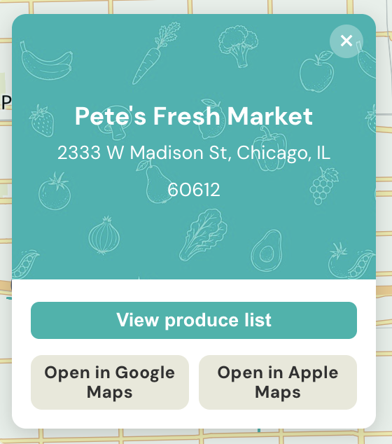
Palette
DM Sans
Brand typeface · Regular · Medium · Bold
Güd Füd. Local Fares.
ABCDEFGHIJKLMNOPQRSTUVWXYZ
abcdefghijklmnopqrstuvwxyz
0123456789 $ ¢ % / — ÜÖÄ üöä
Make savings feel good.
Saving money is often marketed through scarcity and pressure: limited time, lowest price, act now. But the behavior Füd Fare was designed to encourage is more positive—finding good food nearby, discovering local stores, and feeling smarter about where your grocery budget goes.
I built the visual system around that feeling. Bright teal creates a recognizable consumer signal across the interface, while oversized produce photography keeps the food itself at the center of the experience.
The produce is the hero.
Building a world around the produce.
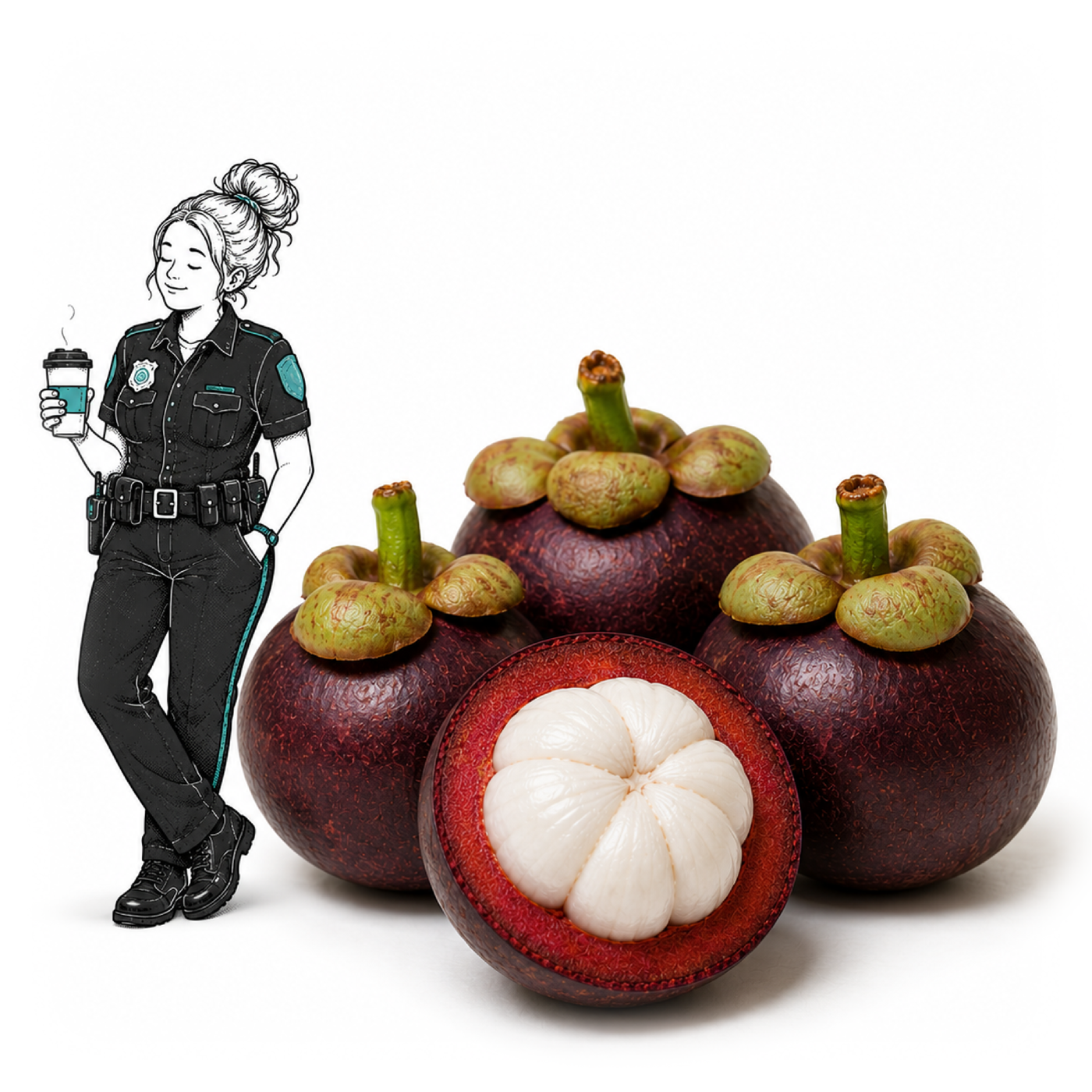
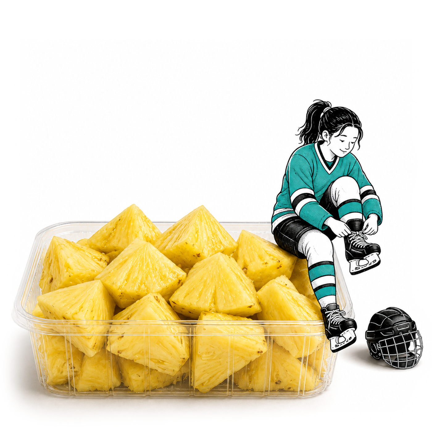
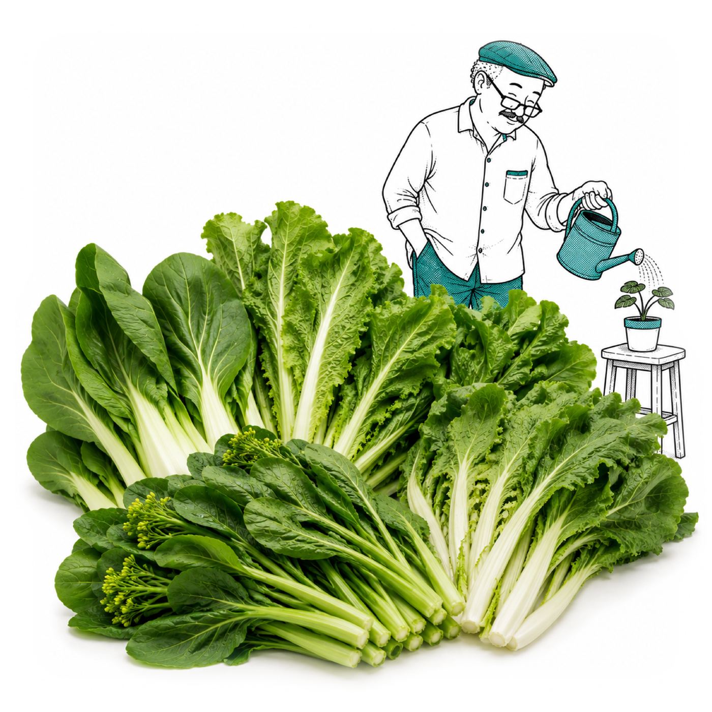
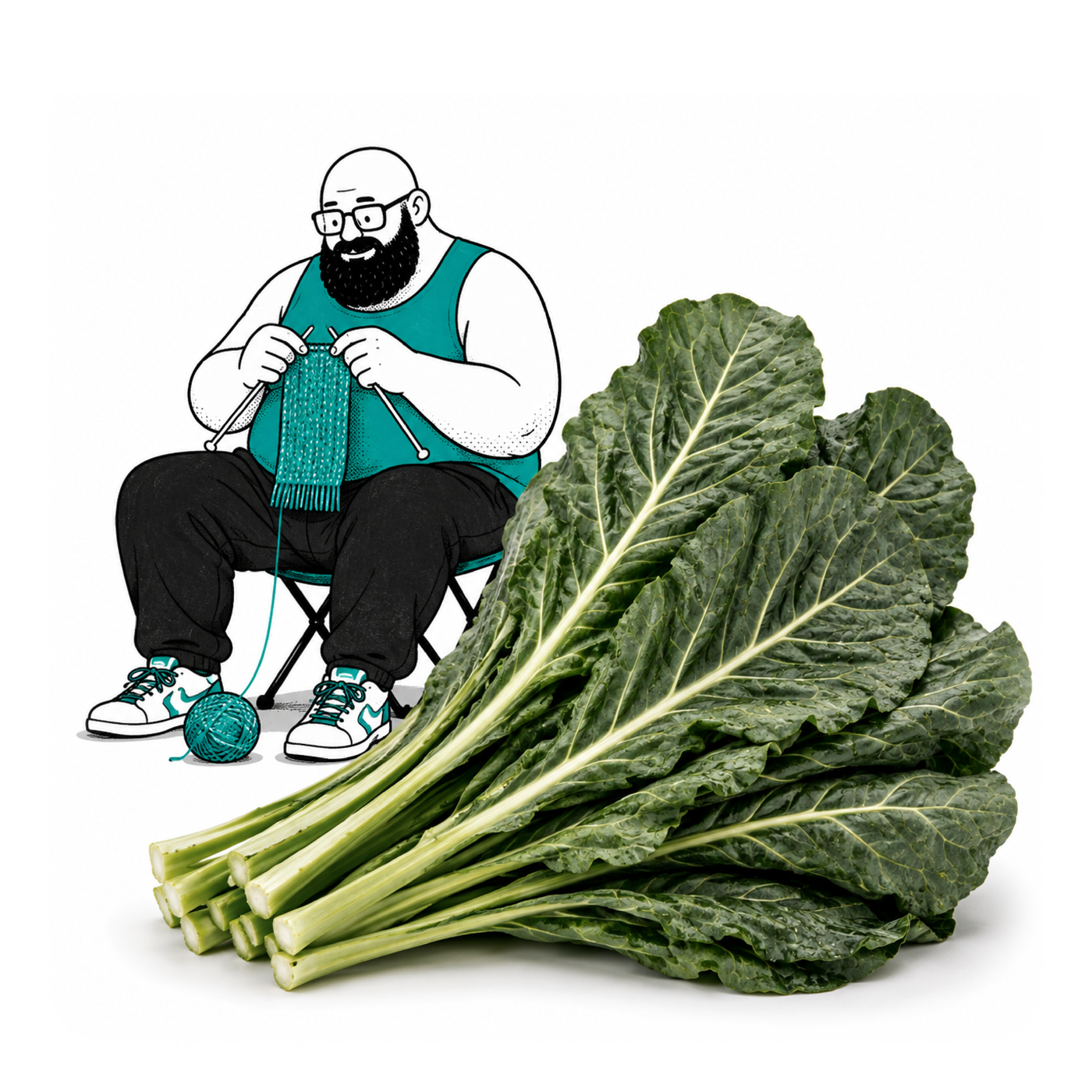
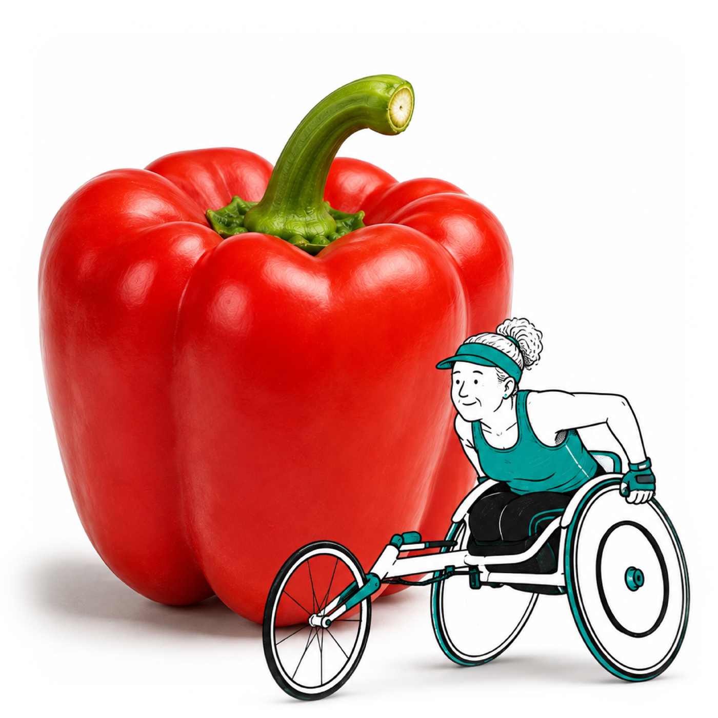
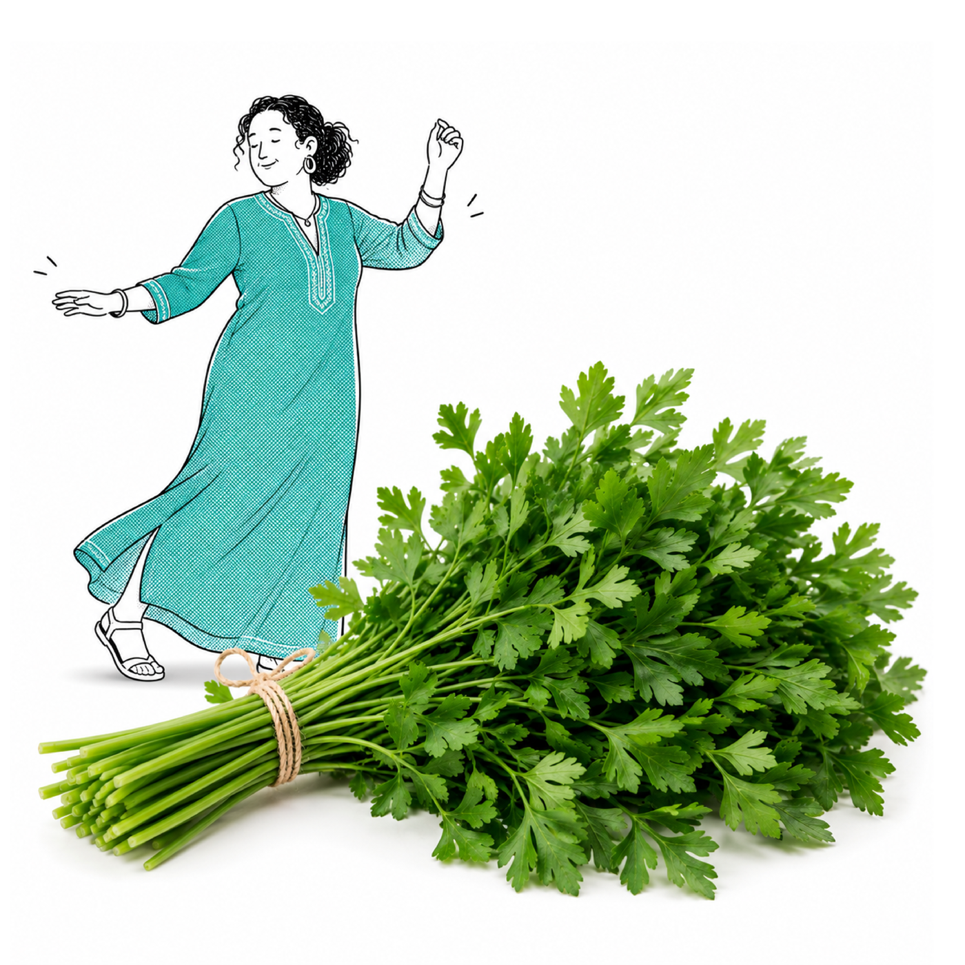
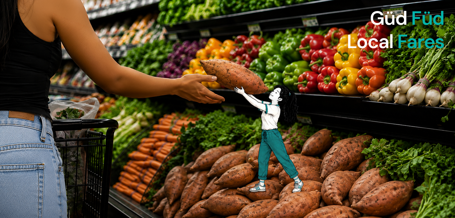
To give the brand a personality beyond price comparison, I developed an illustration system built around oversized produce and tiny human characters interacting with it as though the grocery aisle had become its own world.
The produce remains recognizable and desirable; the people provide the story. Everyday situations become slightly absurd—someone watering a vegetable like a garden, struggling with an enormous yam, or appearing alongside ingredients in unexpected scenes.
Keeping the characters small allowed the product to remain visually dominant while giving Füd Fare a recurring storytelling device that could expand across social, editorial, product education, and advertising.

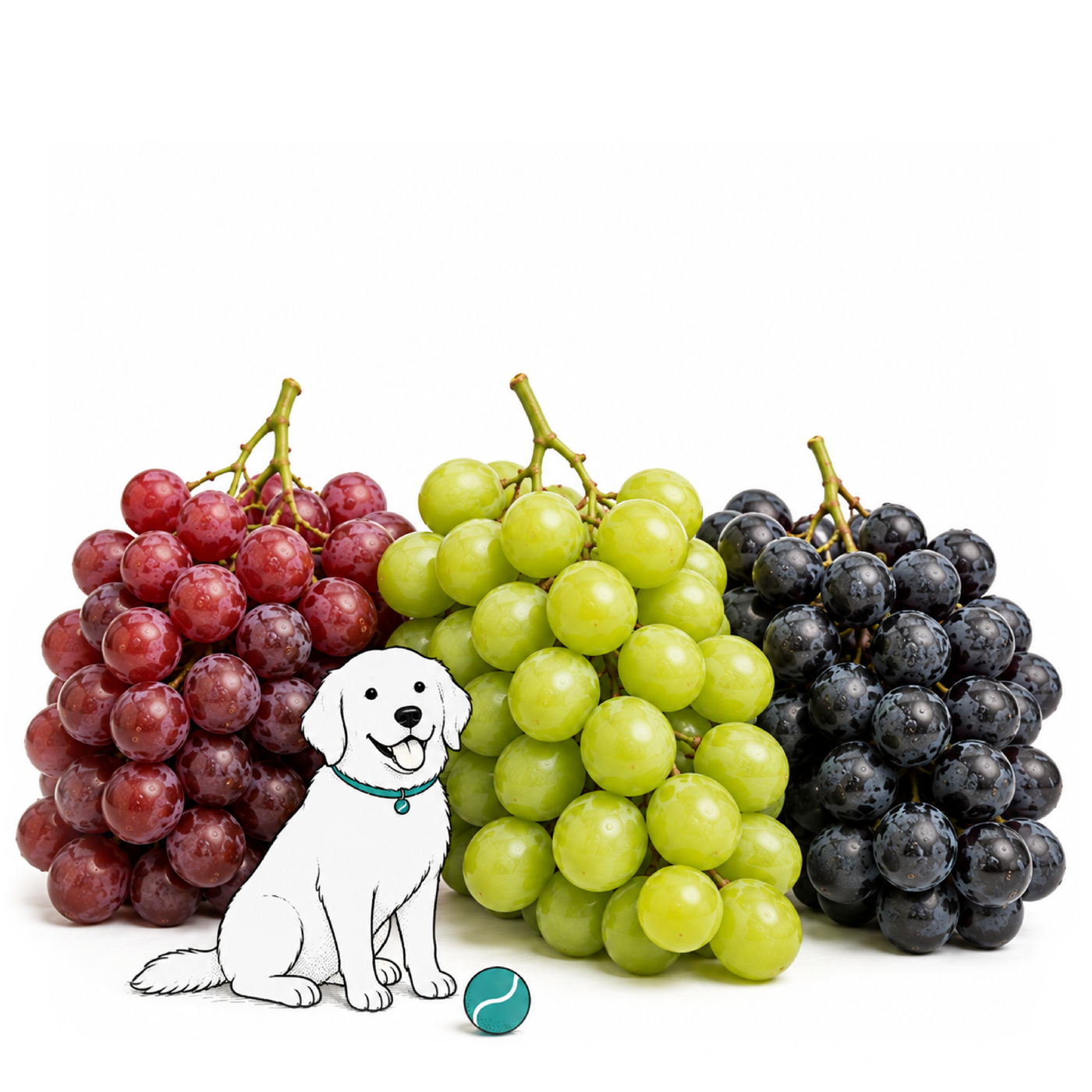






A repeatable character system.
As the character library expanded, I established a consistent set of art-direction rules so individual scenes could vary without losing the Füd Fare world: produce remains oversized and visually dominant, people stay deliberately small, expressions remain simple, environments are grounded in recognizable everyday situations, and the humor comes from the relationship between human scale and food.
That framework made the system extensible. New produce categories could introduce new characters and situations without requiring a new visual concept every time.
Produce
Hero scale
Human
Secondary · ~6" scale
Everyday situation
Recognizable
One strange twist
Füd Fare
Repeat
Useful first. Weird second.
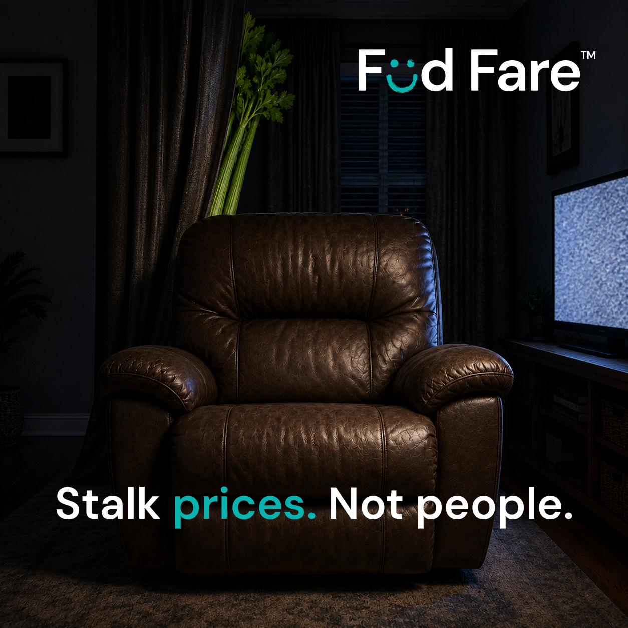
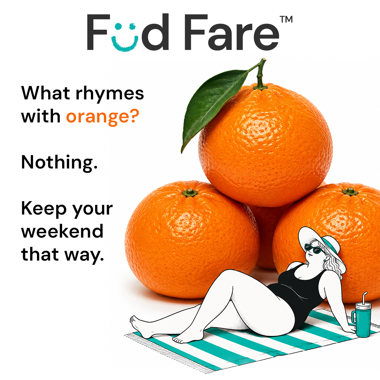
Füd Fare’s voice follows the same principle as its visual identity. Product information stays direct and understandable, while campaign work has more freedom to play with grocery language, familiar phrases, and produce-related absurdity.
That created a system where the application could remain clear and trustworthy while social content developed a much stronger personality.
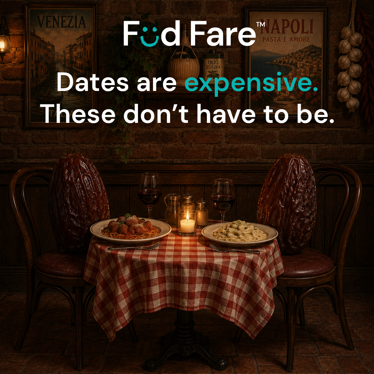
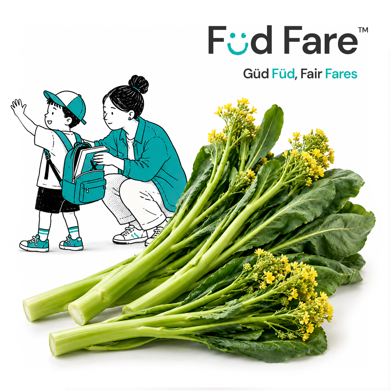

One system. Two jobs.
Product
Clear
Local
Trustworthy
Information-first
Brand
Playful
Memorable
Human
Expressive
Same Füd Fare.
The product and campaign work deliberately operate at different levels of expression. Inside the shopping experience, clarity wins. Outside it, the brand can become louder, stranger, and more playful.
The connective tissue is the same visual language, voice, produce-first art direction, and belief that saving money on food doesn’t have to feel joyless.
A serious system with a very unserious personality.
06 — What I Learned
Knowing what to build also means knowing when to stop.
Füd Fare reached a working prototype in roughly three weeks. The system could ingest pricing from 25 store locations across seven local grocery groups, normalize eligible offers, compare local prices, and turn a shopping list into a store recommendation.
But building the product also exposed a mistake I had made much earlier: I started solving the technical problem before doing enough competitive research.
Once I stepped back and evaluated the broader grocery-price comparison market, I found a crowded category with established products, existing datasets, and competitors with substantially greater resources. Füd Fare had its own point of view—particularly around local grocers, produce, and trustworthy normalization—but I wasn’t convinced that distinction created a strong enough commercial opportunity to justify continuing to invest in it.
So I stopped.
The prototype still answered the question I built it to explore.
Füd Fare began as an experiment in whether messy, visual grocery information could be transformed into something structured enough to support a genuinely useful consumer experience.
The answer was yes—but getting there required far more than extracting text from a flyer. The system needed a product taxonomy, deterministic price logic, disagreement handling, validation rules, geographic constraints, comparison thresholds, and explicit ways to say “I don’t know.”
The biggest lesson wasn’t how to extract more data. It was how much work it takes to earn the right to simplify it.
Trust changed how I think about automation.
Early versions of the pipeline were optimized around successfully producing structured data. Auditing changed that objective. A system that returns an answer isn’t necessarily a successful system—especially when a confident error can immediately damage the user’s trust.
I became much more deliberate about separating tasks that benefit from probabilistic interpretation from tasks that require deterministic behavior. Models could help interpret messy visual information. Code should own arithmetic and business rules. Validation should challenge both. And when the evidence isn’t strong enough, the product should communicate less rather than manufacture certainty.
Before
Can the system produce an answer?
After
Has the system earned the right to show it?
The consumer experience was the other half of the system.
The technical challenge could easily have dictated the personality of the product. I deliberately pushed in the opposite direction.
Füd Fare became one of my favorite exercises in building a consumer brand around complicated infrastructure: taking an ugly data problem and translating it into a bright, approachable experience with its own language, characters, campaigns, and visual world.
The engineering made the information usable. The brand made someone want to use it.
What I’d do differently.
If I approached Füd Fare again, I’d reverse one part of the process: validate the market before validating the architecture.
I proved I could build the difficult part. The more valuable question should have come first—whether building it created enough differentiated value to warrant everything that followed.
Messy data in.
Simple decisions out.
Brand · Product · UX/UI · Systems Architecture · Art Direction
Füd Fare didn’t become a company. It became something equally useful to me: proof that I could move from an everyday consumer problem to a working product, build the technical system underneath it, create the brand around it, test the assumptions behind it—and walk away when the business case no longer justified the build.