TYPESCOUT
See what brands are actually typing with.
Choosing a typeface usually means browsing fonts in isolation. While designing other digital products, I kept running into the same problem: I could find thousands of fonts, but there was no easy way to understand what real brands were actually using—or how those choices changed across industries and brand personalities.
I built TypeScout to turn that question into a usable resource. The platform discovers real brands across the web, identifies the typography used on their sites, and organizes those choices by font, industry, and brand vibe—giving designers a way to explore type through real-world context rather than a specimen sheet.
I conceived, branded, designed, and built the complete product in five after-work days, then developed an autonomous discovery pipeline that allows the directory to continue expanding without manual input. After manually validating the system against an initial set of roughly 200 brands, I turned discovery over to the pipeline.
Today, TypeScout tracks more than 2,900 brands and continues adding approximately 15–40 new brands per day. As the dataset grows, the project is evolving from a font-discovery tool into a record of how typography is actually being used across the web.
2,951
Brands Tracked
1,474
Fonts Cataloged
20
Industry Categories
15–40
Brands Added / Day
5
Days Concept → Live Product
01 — The Problem
Fonts in context, not in a dropdown.
Choosing a typeface sounds simple until you’re staring at hundreds of nearly identical options with very little context for how they’ll actually behave as part of a brand.
I kept running into this while designing my own digital products. Google Fonts made it easy to browse typefaces, but I was still evaluating them largely in isolation. If I wanted to understand what a company was actually using, I had to inspect the site myself, dig through its styles, identify the font, and then repeat the process across other brands.
The friction was high enough that most of the time I simply didn’t do it. I would browse specimens, make educated guesses, and try to imagine how a typeface might feel outside of the preview window.
That exposed a more useful question: instead of asking what fonts are available, what if I could see what brands are actually choosing?
The missing layer was context.
Font libraries organize typography around characteristics like serif, sans-serif, display, and weight. Those classifications are useful, but they’re not necessarily how a designer thinks when building a brand.
I wanted to ask different questions: What are finance brands using when they want to communicate trust? What typefaces repeatedly appear across technology companies? Is the font I’m considering actually unusual—or is everyone already using it?
Answering those questions required connecting typography to the brands already using it.
The old workflow
Too much friction. Not enough context.
Industry
Finance & Banking
Brand Vibe
Trust & Dependability
What are they actually using?
Open Sans
7 brands
Inter
6 brands
Lato
4 brands
Montserrat
3 brands
Roboto
3 brands
Poppins
2 brands
Live directory · 70 brands in this intersection
Old model
Font
Imagine where it might work
TypeScout
Brands
Observe what they’re actually using
TypeScout turns typography from an isolated browsing exercise into a dataset of real-world design decisions.
02 — The Experience
From inspiration to evidence.
TypeScout is designed around the way designers actually explore. You can begin broadly—browsing brands, industries, or visual personalities—and progressively narrow the directory until you’re looking at typography being used in the kind of context you’re trying to create.
Each brand profile connects the identity back to its typography: the live website as visual context, the detected heading and body fonts, industry and vibe classifications, and an explanation of why those choices work together. From there, TypeScout surfaces alternative typefaces used by brands with similar characteristics.
The goal is to shorten the distance between “I need a font that feels like this” and “here’s what brands that already feel like this are actually using.”
Start anywhere. Follow the type.
Brand Profiles
See the type where it actually lives.
A font specimen can show how a typeface looks. A brand profile shows how it behaves as part of an identity.
TypeScout captures the visual context surrounding each brand and connects it to the typography detected on the site. Industry and vibe classifications provide another layer of context, while separate heading and body analysis reveals how different typefaces are being combined within the same system.
Start with the font instead.
Discovery also works in reverse. Selecting a typeface opens its profile and reveals every brand currently using it, turning an individual font into a collection of real-world references.
Instead of evaluating Inter as an isolated specimen, for example, a designer can see how it appears across technology, finance, legal services, energy, and other industries—and whether its ubiquity makes it the right choice for the project at hand.
Inter
205 brands using this font
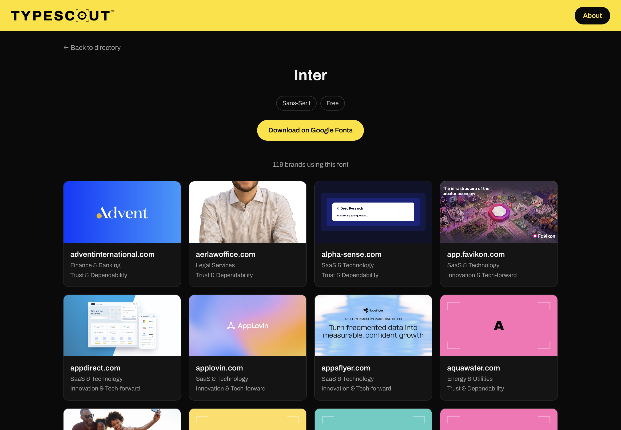
One font, many identities
Four brands. One typeface.
Advent International
Finance & Banking
Trust & Dependability
AlphaSense
SaaS & Technology
Trust & Dependability
AppLovin
SaaS & Technology
Innovation & Tech-forward
AppsFlyer
SaaS & Technology
Innovation & Tech-forward
Same typeface. Different brands. Different contexts.
Looking at one brand helps answer “What are they using?”
Looking at every brand using a font begins to answer something more interesting: “How is everyone using type?”
03 — The Data
Individual choices become patterns at scale.
A single brand can show how a typeface works in context. Thousands of brands begin to show how typography moves across entire categories.
Every brand accepted into TypeScout is connected to a defined industry, brand vibe, heading font, and body font. That structure makes the directory useful beyond individual references: the same dataset can reveal which typefaces repeatedly appear within certain kinds of brands, which fonts have become widespread conventions, and which remain relatively uncommon.
TypeScout doesn’t treat popularity as a recommendation. Instead, it gives designers another piece of evidence to work with—helping distinguish between an established visual convention and a less common choice.
One brand
Wise
One decision
Wise Sans heading
Inter body
2,951 brands
Thousands of typographic decisions
The directory becomes the dataset.
See what an industry gravitates toward.
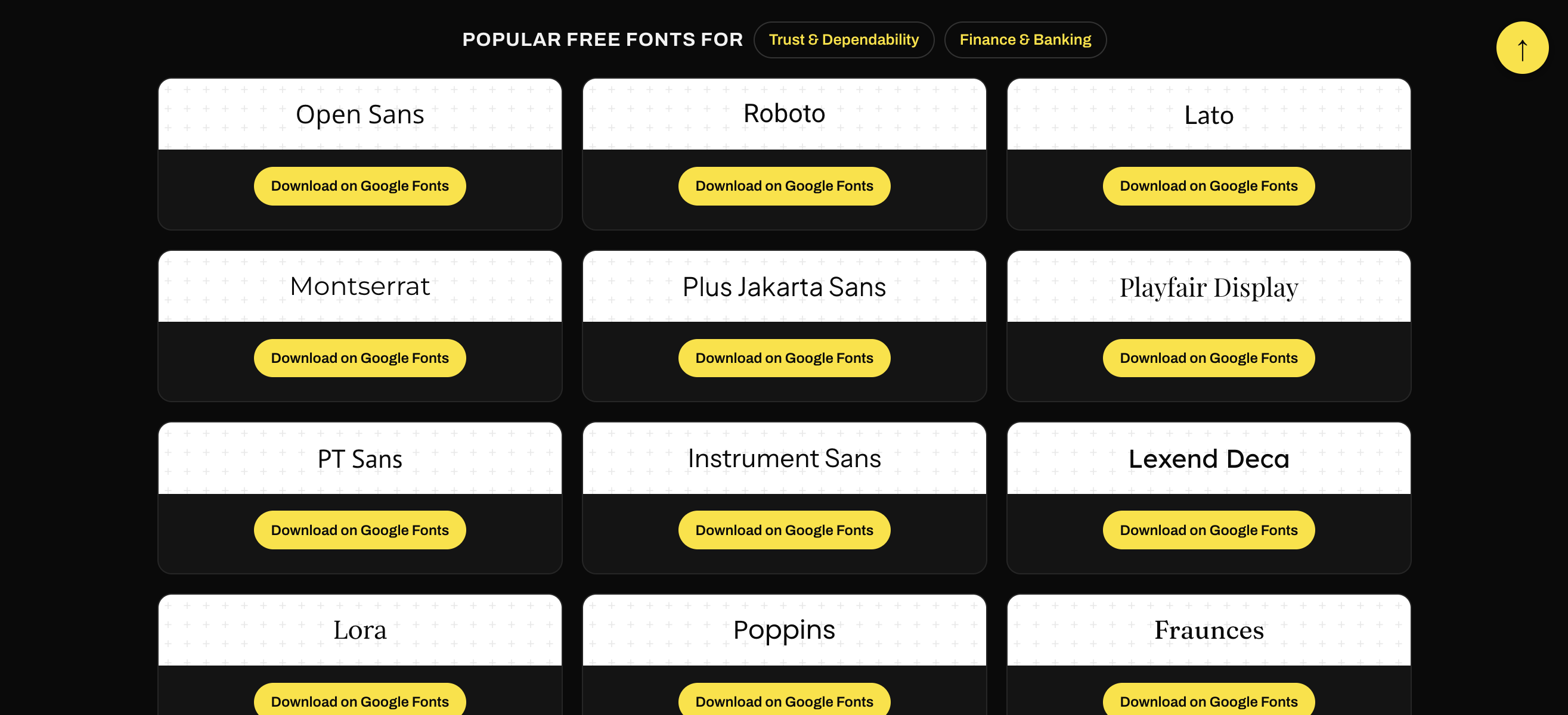
Filtering by industry and vibe reveals the typefaces appearing within a specific branding context. Rather than assuming what “finance” or “trustworthy” typography should look like, designers can inspect the choices brands in that intersection are already making.
The result isn’t a prescription. It’s a reference point.
Popular doesn’t mean right
How common is the font you’re considering?
TypeScout also counts how many brands in the directory currently use each typeface. That turns popularity into another design input.
A heavily adopted font may provide familiarity, accessibility, and an established visual convention. A rarely used typeface may create distinction—or simply be uncommon for a reason. TypeScout doesn’t decide which is better; it makes the tradeoff visible.
1,191 of the 1,474 typefaces in the directory appear on exactly one brand. Adoption is a design input, not a verdict.
The classification system
One brand. One industry. One vibe.
As the directory grew, I deliberately kept classification mutually exclusive. Every brand receives one primary industry and one primary vibe rather than appearing across every category that could plausibly apply.
The constraint sacrifices some nuance, but protects the usefulness of the dataset. If the same brand repeatedly appeared across overlapping classifications, category counts would become inflated and patterns harder to trust.
At scale, consistency became more valuable than exhaustive labeling.
wise.com
Industry
Vibe
One definitive classification
A snapshot today. A timeline tomorrow.
TypeScout currently shows how typography is being used across its growing directory. Because the system continues discovering and recording brands over time, that same structure creates the foundation for something more interesting: observing how those patterns change.
A font that dominates an industry today may decline. Another may quietly spread across categories before becoming an obvious design trend. The longer the directory operates, the more opportunity there is to study those movements historically.
What happens when a font trend becomes measurable before it becomes obvious?
04 — The Pipeline
Built in five nights. Designed to keep growing.
I conceived, branded, designed, and built the first complete version of TypeScout in five after-work days. Rather than separating brand development, product design, and technical architecture into distinct phases, I developed them together—using the working product itself to test and refine the system as it took shape.
I manually collected and evaluated roughly 200 brands while developing the initial extraction and classification rules. Once I was confident the system could reliably identify and organize brands without constant intervention, I transitioned discovery to an autonomous pipeline.
Today, TypeScout continuously discovers new websites, determines whether they belong in the directory, extracts their typography and visual context, classifies them, and publishes accepted brands automatically.
The goal wasn’t simply to build the directory. It was to build the system that could keep building the directory.
01 — Discover
Find potential brands across targeted industries.
Discover → Verify → Structure → Publish → Repeat
Designing for the messy web
Websites don’t behave like clean datasets.
The first challenge was extraction. Website code is inconsistent, typography isn’t always declared cleanly, custom fonts appear under unpredictable names, and visual content can change depending on loading behavior, cookie banners, or bot protection.
Rather than relying only on CSS declarations or metadata, TypeScout renders each site and inspects the computed typography being displayed to the user. Detected fonts are then resolved against known libraries before the brand moves deeper into the pipeline.
What the CSS declares
font-family: __Wise_0c09d6,
-apple-system, BlinkMacSystemFont,
"Segoe UI", system-ui, sans-serif;
What the browser renders
Heading → Wise Sans
Body → Inter
I designed around how the source actually behaves instead of how I wished it behaved.
Cheap decisions first
Don’t spend resources on something you’ve already seen.
As the directory scaled, I ordered the pipeline so inexpensive decisions happen before expensive ones. Previously processed domains and regional duplicates are rejected before rendering or AI evaluation, preventing unnecessary scraping, model calls, and repeated work.
A persistent processed-domain record also means TypeScout remembers failures and rejections—not just successful brands—so the same bad candidate doesn’t consume resources every time discovery encounters it.
New domain
Seen before?
Render
AI evaluation
Reject early. Spend late.
Representative discovery
The easiest data wasn’t the right data.
Early autonomous discovery immediately exposed a bias: technology companies dominated the results because they’re highly visible online and easy for search systems to find.
That would have made TypeScout larger without necessarily making it better. I wanted the directory to reflect typography across nonprofits, beauty brands, finance, retail, healthcare, and other categories—not simply whichever companies were easiest to discover.
I restructured discovery around category coverage, allowing underrepresented industries to receive priority as the directory grows.
Early autonomous discovery
Growing toward
Relative coverage · illustrative
More data wasn’t the objective. Better coverage was.
Not everything is solved.
Website screenshots remain the least reliable part of the pipeline. Some sites load slowly, block automated browsers, present cookie or CAPTCHA layers, or delay visual content beyond the capture window. I improved timing and failure detection, but the problem isn’t completely solved.
Rather than hiding that limitation, TypeScout treats imperfect extraction as something to continue auditing as the dataset grows.
5 Days
From idea → working product
I wanted TypeScout to demonstrate that I could build useful infrastructure for creative people—not just conceive what that infrastructure should be.
The result is a system I no longer need to operate manually. Discovery, extraction, classification, and publishing continue in the background while the directory grows on its own.
It. Just. Runs.
05 — The Living Directory
I built it. Now it builds itself.
TypeScout launched as a five-day experiment. Today, it operates as a live, autonomous typography directory—continuing to discover, classify, and publish new brands without requiring me to maintain the dataset by hand.
What began with roughly 200 manually collected brands has grown beyond 2,900, with approximately 15–40 new brands added each day. Every addition makes the directory more useful: another example of typography in context, another data point within an industry, and another connection between a typeface and the brands choosing to use it.
For now, TypeScout is deliberately simple. Search a brand. Explore an industry. Find a font. See who’s using it. The infrastructure underneath is designed to let the value of that experience compound as the dataset grows.
2,951
Brands Tracked
1,474
Fonts Cataloged
15–40
New Brands / Day
20
Discovery Categories
0
Manual Publishing Required
Early behavior
People are beginning to find it.
TypeScout has only recently begun appearing in search results, but early organic visitors are already using the directory across the behaviors it was designed around—browsing brands, sorting results, interacting with fonts, and filtering the dataset.
At this stage, I’m treating that activity as product observation rather than traction. The more important signal is whether people who arrive understand what the tool is for and actually use the research interactions available to them.
48%
30-Day Bounce Rate
Observed interactions
The interesting part
A snapshot today. A historical record tomorrow.
Typography trends rarely announce themselves. They accumulate through thousands of individual design decisions until a typeface that once felt distinctive suddenly feels ubiquitous.
I remember when Gotham seemed to be everywhere. Years later, fonts like Montserrat became increasingly common across digital brands. Those transitions are easy to recognize in hindsight, but much harder to observe while they’re happening.
Because TypeScout continuously records typography alongside brand and industry context, the dataset creates the foundation for studying those changes over time.
TypeScout doesn’t have enough historical data to make those claims yet. The opportunity is in letting the record accumulate.
Typography adoption over time
Conceptual — illustrating future longitudinal analysis
Which fonts are gaining adoption?
Which are declining?
Which industries change first?
Do certain visual identities converge on the same typography?
When does an emerging choice become a convention?
The design-industry angle
Watching visual language move.
Fonts sit unusually close to the foundation of a brand identity. Tracking their adoption won’t explain every shift in design, but it can provide one measurable signal of how visual conventions move across industries.
At sufficient scale and over enough time, TypeScout could become less about discovering individual fonts and more about observing the typography layer of the web itself.
What TypeScout proved
I started TypeScout because I wanted to build something genuinely useful for creative people—and to test whether I could take a problem beyond creative direction into product design, information architecture, and working infrastructure.
Five after-work days later, the product was live. Since then, the most satisfying part has been watching it continue doing the job without me.
Building TypeScout reinforced something I’ve increasingly brought into my creative practice: I don’t have to stop at defining the idea or directing its execution. I can design the system that makes the idea work.
The directory keeps growing.
TypeScout · Independent Project · 2026
Creative Direction · Brand Identity · Product Design · UX/UI · Information Architecture · Systems Design · AI-Assisted Development
Visit TypeScout